What are the differences between the three layouts in the Pro-Plan?

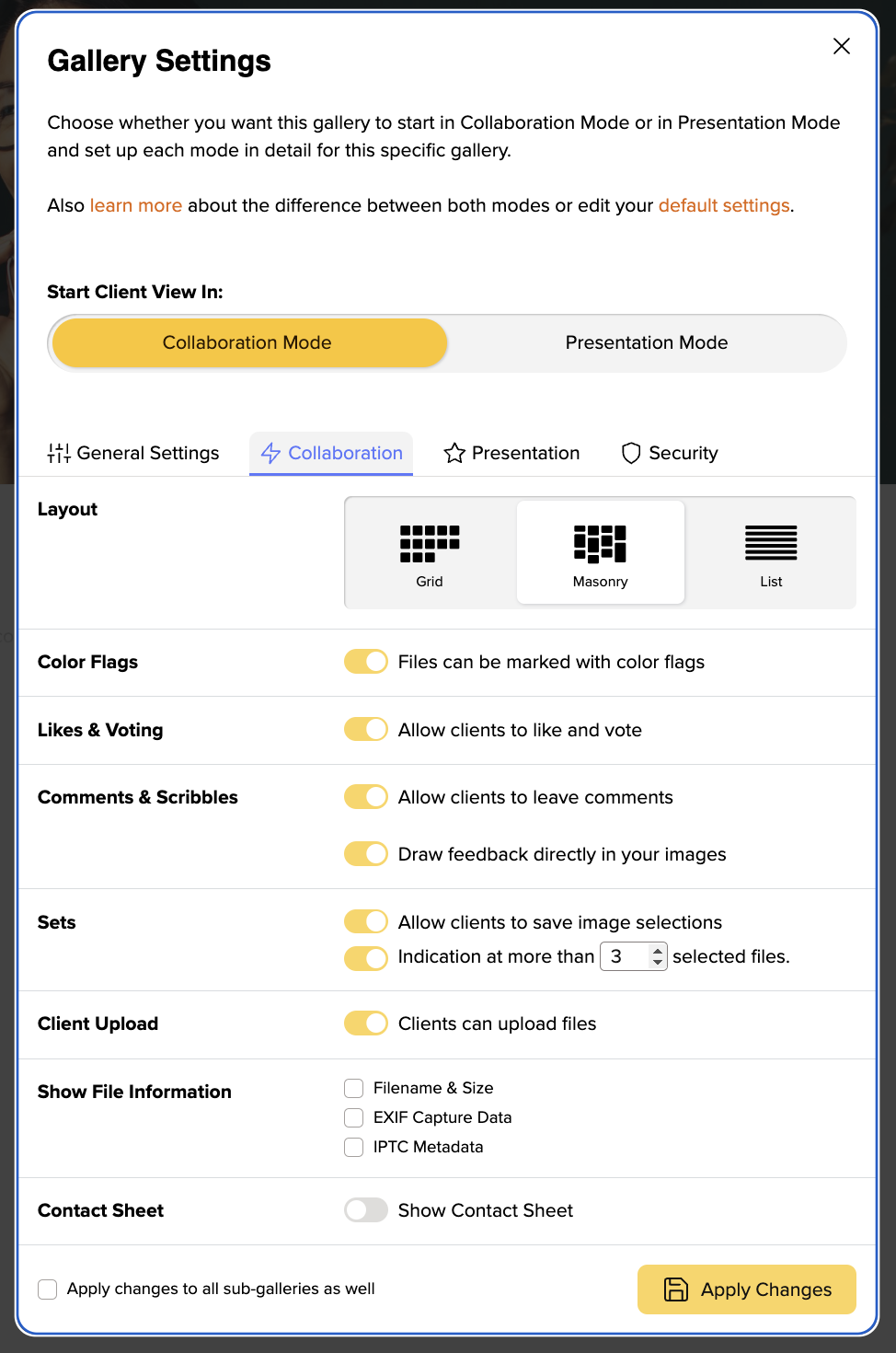
In your trial month as well as plans starting from the Pro plan you will have three different gallery layouts to choose from.
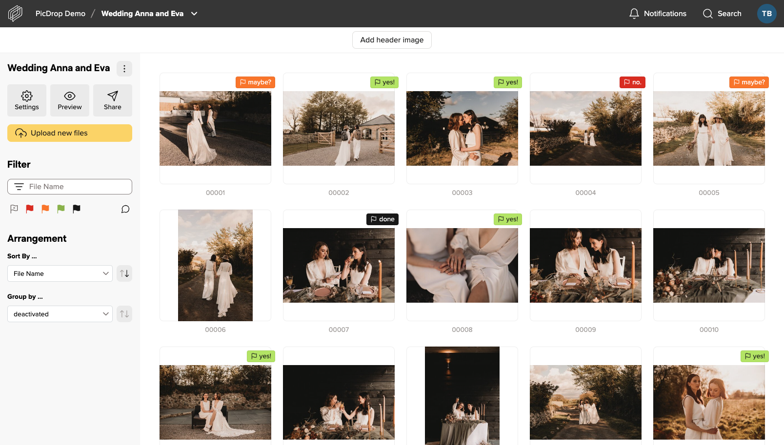
Grid layout
The grid layout is the layout that will automatically be used when a new gallery is created. Unless you have changed this in your own default settings. This layout gives your clients a quick, orderly overview of all images. Thus, making it the ideal layout for working with professionals such as picture editors or corporate clients who want to quickly make a selection and get an overview of all images.

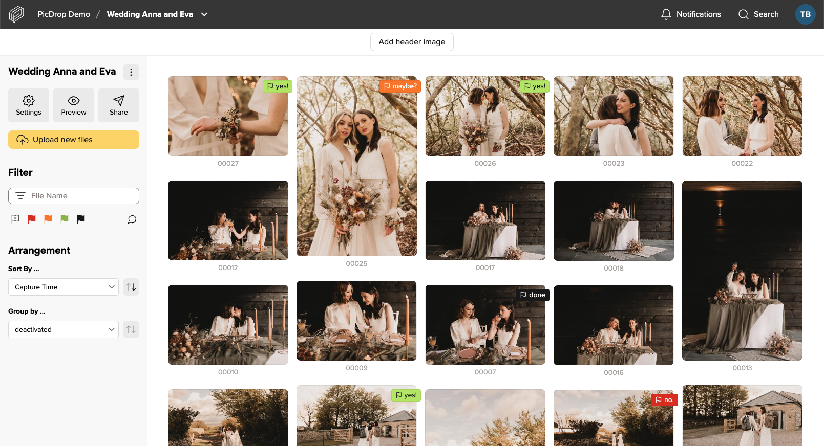
Masonry layout
The main difference between the Masonry layout and the grid layout is that the images are displayed much larger and the arrangement is "fluid". One preview image after the other – this makes the gallery look prettier overall, but may also be a bit more confusing. The layout is therefore perfect for private clients, e.g. weddings, where presentation is more important than sets and quick comparison of similar images. Especially in combination with the large header image (also included in the Pro plan) your galleries will look much more impressive.

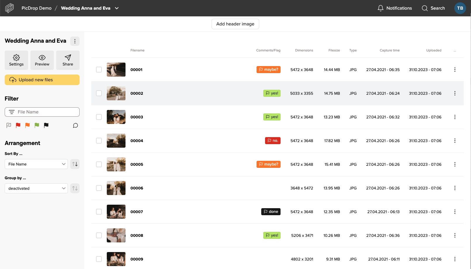
List layout
The list view is intended for fast file exchange between professionals working together on a project. If you're looking for a file with specific attributes such as dimensions or file type, this view is great for sharing with post-producers or staff who know exactly what they're looking for and need quick access to it. We recommend that you sort the view in the gallery settings so that the last upload is always on top.

Get the layouts
You can switch between the layouts in each gallery in the Pro and Business Plan.
